Implementing App Locations: Full Page
The Full Page location gives you full screen real state in Contenstack to integrate your applications. This will display on the left main navigation bar with the icon you chose when registering the location in Developer Hub:
In that location, the app sdk framework exposes the application configuration data, as well as other objects such as the stack, user, etc... similar to the Stack Dashboard Widget location.
When the user clicks on the icon on the left navigation bar, the app will get loaded inside an iframe in the main area within the dashboard.
Use Case
One of the most common use cases in Contenstack to leverage the full page location, is typically when you want to add additional functionality or a custom application that requires a larger space to be used. With this extension location you have endless possibilities, and you can even bring your own custom app that might not necessarily interact with Contenstack, but that makes sense to have integrated so your editors go to the same place to do all their work. For example, you can implement access to a network location to access certain files and documentation; you can provide a dashboard with useful information and/or useful resources so your editors can access those at a glance; etc. A good example of an existing full page sidebar extension managed and maintained by Contenstack is the Release Preview marketplace app.
In order to read the configuration values and the get access to the available objects in this location, you can use the following code snippet:
useEffect(() => {
ContentstackAppSDK.init().then(async (appSdk) => {
const config = await appSdk?.getConfig();
setState({
config,
location: appSdk?.location,
appSdkInitialized: true,
});
});
}, []);
Exercise 6
In this exercise you will display display a table with all the entries for one specific content type. You will be able to select the content type using an dropdown, and upon selection of the content type, the table will update its data with the list of entries based on the selected content type.
Using your code editor, access the file located at: src/containers/FullPage/FullPage.tsx
In order to use the Select venus component, import it from the venus component library adding this piece of code at the tope of the file:
import { Select } from "@contentstack/venus-components";
Now, inside the FullPageExtension component, add the following code snippet to create a state variable to store the available content types:
const [contentTypes, setContentTypes] = useState<any[]>();
Inside the useEffect code, and within the appSdk.init() , add the following code snippet to get all the available content types from the stack object and to store them in the previously defined state:
const { content_types } =
(await appSdk?.location?.FullPage?.stack?.getContentTypes()) || {};
setContentTypes(content_types);Next, you will add a Dropdown component to contain the different content types to use in the UI by the users. For this, you first need to create a local state to store the options and the selected Content Type. Right after the previous snipped code, paste this code, too:
const [contentTypeOptions, setContentTypeOptions] = useState<any[]>([]);
const [selectedContentType, setSelectedContentType] = useState<any>("");Additionally, you will need to add the following code snippet, after the existing useEffect hook:
useEffect(() => {
if (!state.appSdkInitialized) return;
let dropdownOptions: any = [];
contentTypes?.forEach((contentType: any) => {
dropdownOptions.push({
label: contentType?.title,
value: contentType?.uid,
});
});
setContentTypeOptions(dropdownOptions);
}, [contentTypes]);Next, you will need a listener to update the selected Content Type whenever the user selects a different value. Add the following code snippet right after the code you just pasted:
const handleDropdownChange = (e: any) => {
setSelectedContentType(e);
};Next, you will add the UI Select dropdown element. Replace the {/* your code goes here */} placeholder with the following code:
<Select
options={contentTypeOptions}
value={selectedContentType}
onChange={handleDropdownChange}
placeholder="Select Content Type"
selectLabel="Content Type"
/>;Now that we are done with the data retrieval and UI selection of content types, let's work on the display of the entries associated with each content type. For that you will need:
A state variable to store the current list of entries
A function that will retrieve the entries for the selected content type
A useEffect hook that will run every time the content type selection changes, and that will update the table accordingly.
Copy the following code inside your FullPageExtension right before the return statement:
const [entriesData, setEntriesData] = useState<any[]>([]);
const getEntriesOfAContentType = async (contentTypeUid: any) => {
const { entries } =
(await state?.location?.FullPage?.stack
?.ContentType(contentTypeUid)
.Entry.Query()
.find()) || {};
setEntriesData(entries);
};
useEffect(() => {
if (!Object.keys(selectedContentType).length) return;
getEntriesOfAContentType(selectedContentType?.value);
}, [selectedContentType]);And lastly, let's add the UI component and code to display the table of entries. We will be using the InfiniteScrollTable component like we did previously in a past module. Let's import that component adding this clause at the top of the file:
import { InfiniteScrollTable } from "@contentstack/venus-components";
Now, right before the return statement, paste this snippet to define the columns of our table:
const columns = [
{
Header: "Title",
accessor: "title",
columnWidthMultiplier: 1.9,
},
{
Header: "UID",
accessor: "uid",
id: "uid",
columnWidthMultiplier: 1.5,
},
{
Header: "Locale",
accessor: "locale",
columnWidthMultiplier: 1,
},
{
Header: "Updated At",
accessor: (obj: any) => {
return new Date(obj?.updated_at).toUTCString();
},
columnWidthMultiplier: 2,
},
];
Note: we have converted the date into a UTC string to display in the table. To learn more about this component, please visit our Venus Component Library documentation.
Let's keep adding some more code. To signal the loaded state of the rows in the Table, you need to maintain a status map object. Copy this code snipped right after the columns variable you just defined:
let itemStatusMap: any = {};
useEffect(() => {
entriesData?.forEach(
(_: any, index: any) => (itemStatusMap[index] = "loaded")
);
}, [entriesData]);And lastly, let's add the table UI elements. Copy this JSX snippet right after the Select JSX component you pasted earlier:
<InfiniteScrollTable
data={entriesData}
columns={columns}
uniqueKey={"uid"}
totalCounts={entriesData.length}
fetchTableData={() => {}}
loadMoreItems={() => {}}
itemStatusMap={itemStatusMap}
/>;Save your file and make sure that your application is still running with no errors.
Tip: in case you might have experienced any issues or your application is erroring, the final code is provided in the src/containers/FullPage/solution.txt file, which contents you can copy and paste into the src/containers/FullPage/FullPage.tsx file.
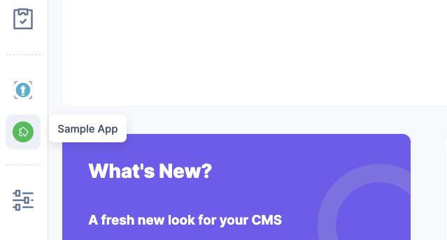
Let's take a look at the Full Page extension. From the Stack dashboard screen, access the Full Page location by clicking on the Sample App icon:

You should see something like this:
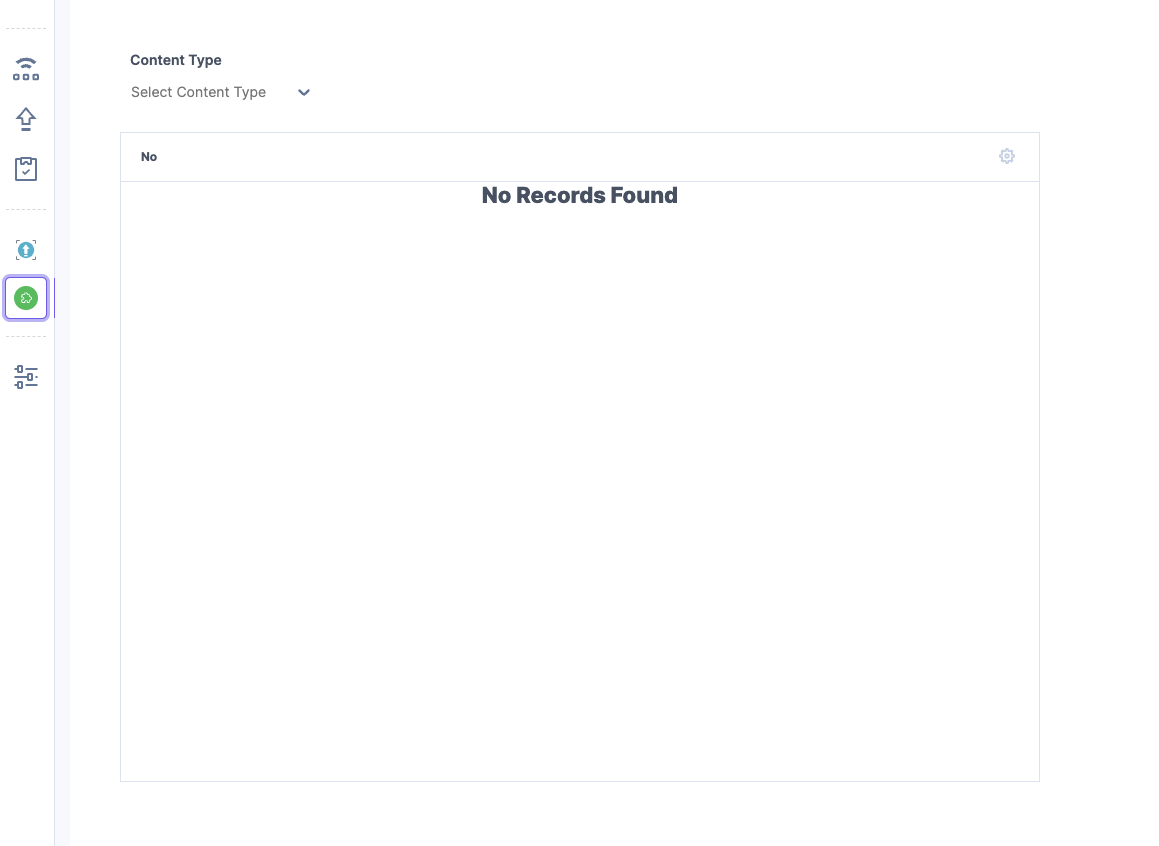
Then select a content type form the dropdown and the table should update accordingly
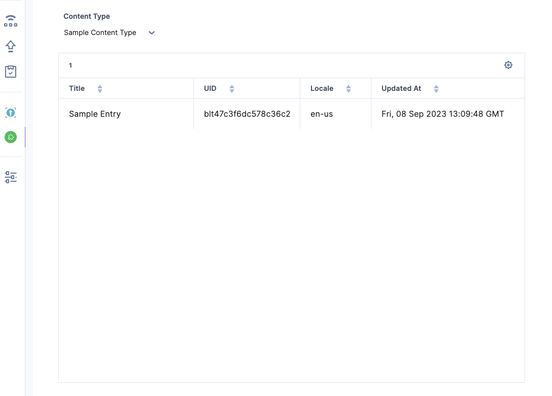
As you can see, the full page shows the dropdown with the available content types in the stack, and upon selection, a table with the list of entries based on such content type is also displayed. This is a basic example but should give you the foundation to create your own full page application with a more complex UI as needed.
Tip: make sure you go over the entire code in the file to get a better understanding on how the logic access the configuration and the asset data.
If you want to learn more about this location, please visit our documentation: Full Page Location
Next, you will develop a Field Modifier location extension.
Video: Implementing Full Page Location
The following video walks you through the previous exercise steps so you can review and follow along: