.svg) Headless Content Management
Headless Content Management.svg) Real-time Data and Insights
Real-time Data and Insights.svg) Omnichannel Personalization
Omnichannel Personalization.svg) Agents & Automations
Agents & Automations.svg) Front-end Hosting
Front-end Hosting

Connect Content with Data Binding
Note: Studio is currently part of an Early Access Program and may not be available to all users. Contact the Contentstack support team; they will coordinate with the appropriate stakeholders to review eligibility.
Data binding in Studio allows you to dynamically link components to content from Contentstack entries. With Repeaters and Condition Blocks, developers and content managers can display lists, modular blocks, and reference fields efficiently, without manually adding each component for every data item.
In addition to components, data binding can also be used within the Design tab, enabling design values to be populated directly from linked entries. Static data is also supported for testing or for use cases where entries are incomplete.
This guide demonstrates how to use these features to build dynamic, data-driven page structures in Studio.
Prerequisites
Before connecting components to data, ensure the following setup is complete:
- Ensure you have set up your Studio project and connected it to your front-end project (CSR or SSR).
- You have Admin or Developer permissions to modify composition structure.
- The content model includes entries with group, modular block, or reference fields.
Additional Resource: Review the previous Studio guides to understand how to set up and create compositions.
Bind Data from Contentstack Entries
Bindings can be configured by both developers and content managers, making Studio a visual editing interface for live Contentstack data.
To bind data to a component, log in to your Contentstack account and perform the following steps:
- Navigate to your Studio project and open the composition where you want to connect data.
- On the Canvas, select the component (for example, Hero Banner or Product Card).
- Open the Page Data tab and click Link Entry to select entries from the target content type.
- Open the Settings tab and map the required fields.
When displaying multiple data items (for example, a navigation menu or modular blocks), Repeaters and Condition Blocks make the layout dynamic and scalable.
- Repeater automatically renders UI elements for every item in a dataset.
- Condition Block helps manage modular or reference-based content where each data type has its own layout.
Bind Data with a Repeater for Group Fields
Use a Repeater when you want to automatically render repeating elements from a list or array of data, such as navigation items or cards.
- Open your page composition in Studio.
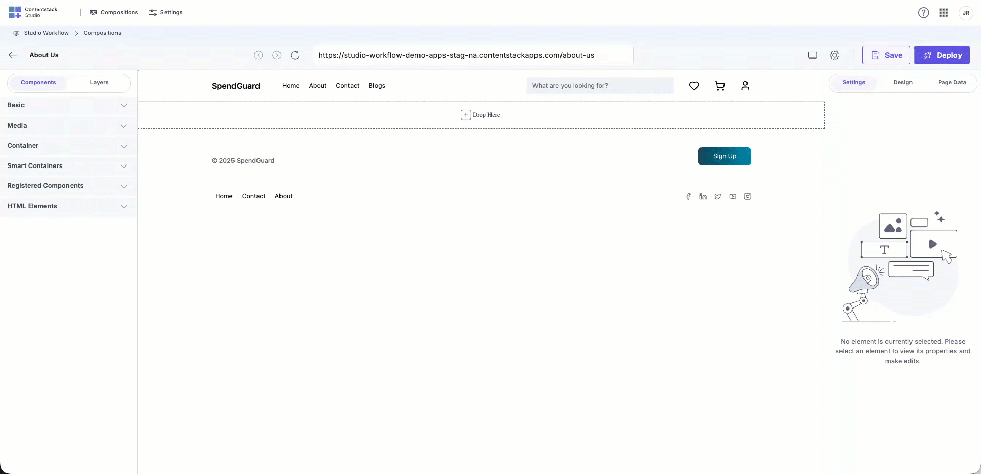
- From the Components tab, drag a Repeater from the Smart Containers section onto the Canvas.
- Inside the Repeater, drag a Text component or any component that should repeat.
- Bind the Repeater to an entry field that contains multiple data items (for example, group, modular block, or global field) using the Settings tab.
- Within the data binding pop-up, open the Repeater Data section to select fields within the parent field.
- Toggle on Preview Mode under Settings > Configurations to view the bound data in the Canvas.
The Repeater automatically repeats the UI component for each item in the data set. Adding or removing items in Contentstack updates the layout in Studio automatically.
Use Repeater and Condition Blocks for Modular Blocks
When an entry includes a Modular Block field, each block may have a different schema (for example, Hero Banner or Section with Buckets). A Repeater combined with Condition Blocks ensures that each block type renders the correct layout.
For example, consider a page content type containing a modular block field named Page Components with multiple sections such as Hero Banner and Feature Section.
- In your page composition, drag a Box or Container onto the Canvas.
- Inside it, drag a Repeater component.
- Bind the Repeater to the modular block field (for example, Page Components) in the Settings tab.
- Inside the Repeater, drag a Condition Block.
- In the Settings tab, open Repeater Data, and create a condition where the block type equals Hero Banner.
- Inside the Condition Block, design the Hero Banner UI by adding components such as headers, paragraphs, and CTAs.
- Set the condition in the conditional block to specify when the component should render.
- Link data fields to each component from the Repeater context of the data binding pop-up.
- Turn on Preview Mode to view the bound content dynamically.
Repeat these steps for each modular block type:
- Add a new Condition Block for each block (for example, Section with Buckets).
- Design and bind UI components for each schema.
Studio automatically renders the correct design for each modular block based on its schema and content.
Bind Data from Reference Fields
Reference fields link to entries from other content types. Since each linked entry may have a different schema, use a Repeater with Condition Blocks to render them correctly.
- Drag a Box or Container onto the Canvas.
- Inside it, drag a Repeater.
- Bind the Repeater to the Reference field in your content type.
- Inside the Repeater, drag a Condition Block.
- In the Condition settings, choose the Content Type that this condition should render (for example, Blogs).
- Inside the Condition Block, add components such as Text or Image.
- Bind component fields (for example, Text → Title).
- Turn on Preview Mode to verify the content rendering.
The combination of Repeaters and Condition Blocks ensures each referenced entry displays according to its schema and layout.
- Use a Repeater for rendering multiple items with identical structure.
- Use Condition Blocks for mixed-schema data such as modular blocks or references.
- Toggle Preview Mode to verify bound data visually.
- Adding new entries or blocks automatically updates the layout in Studio.
Bind Data from Component Props
The StudioComponent supports an optional data prop in addition to specOptions. This data prop accepts an object whose properties are available within component props and design values.
To bind data using component props, log in to your Contentstack account and perform the following steps:
- Navigate to your Studio project and open the target composition.
- On the Canvas, select the component to bind (for example, Hero Banner or Product Card).
- Open the Settings tab.
- Click the database icon to open the data binding pop-up.
- Locate the Component Data section and map fields as required.
Example mapping:
| Component Prop | CMS Field |
| Title | title |
| Description | description |
| Image | image.url |
Before binding fields in the Studio UI, pass data to the component using the data prop. Each property in this object becomes available for mapping under Component Data.
const data = {
  title: "Hero banner title",
  description: "Short description for the hero banner",
  image: {
    url: "https://example.com/banner-image.png",
  },
};
return <StudioComponent data={data} />;
Once defined, these values appear in the data binding panel and can be mapped to CMS fields, such as title, description, and image.url.
Choose a Binding Type
Studio supports three binding types depending on the use case:
Static Text
Use static text for fixed content that doesn’t need to update dynamically, such as labels, headings, or short messages.
Data from Contentstack
Dynamic data bindings connect Studio components directly to live CMS entries. These entries are linked when creating a linked composition or through the Page Data tab.
Bind from the Design Side
Data binding can also be applied from the Design tab. Design bindings allow component styles and properties to dynamically reflect live data values.
- Open the Design tab.
- Click the vertical ellipsis and choose Dynamic Data.
- In the data binding pop-up, select the desired field.
- The component’s design properties update automatically in the Canvas.
Binding from the Contentstack data can be used in two ways: as text rendered on the page through the Settings tab or as dynamic values applied to component styles within the Design tab.
Data binding in Studio makes composable pages dynamic, scalable, and efficient. By combining Repeaters and Condition Blocks, components automatically adapt to changes in underlying data models.
Design-side bindings further enhance flexibility, allowing both developers and designers to manage dynamic layouts visually.
For next steps, refer to the Import and Manage New Designs guide to continue optimizing Studio configurations and design consistency.
More articles in "Key Use Cases"
