.svg) Headless Content Management
Headless Content Management.svg) Real-time Data and Insights
Real-time Data and Insights.svg) Omnichannel Personalization
Omnichannel Personalization.svg) Agents & Automations
Agents & Automations.svg) Front-end Hosting
Front-end Hosting

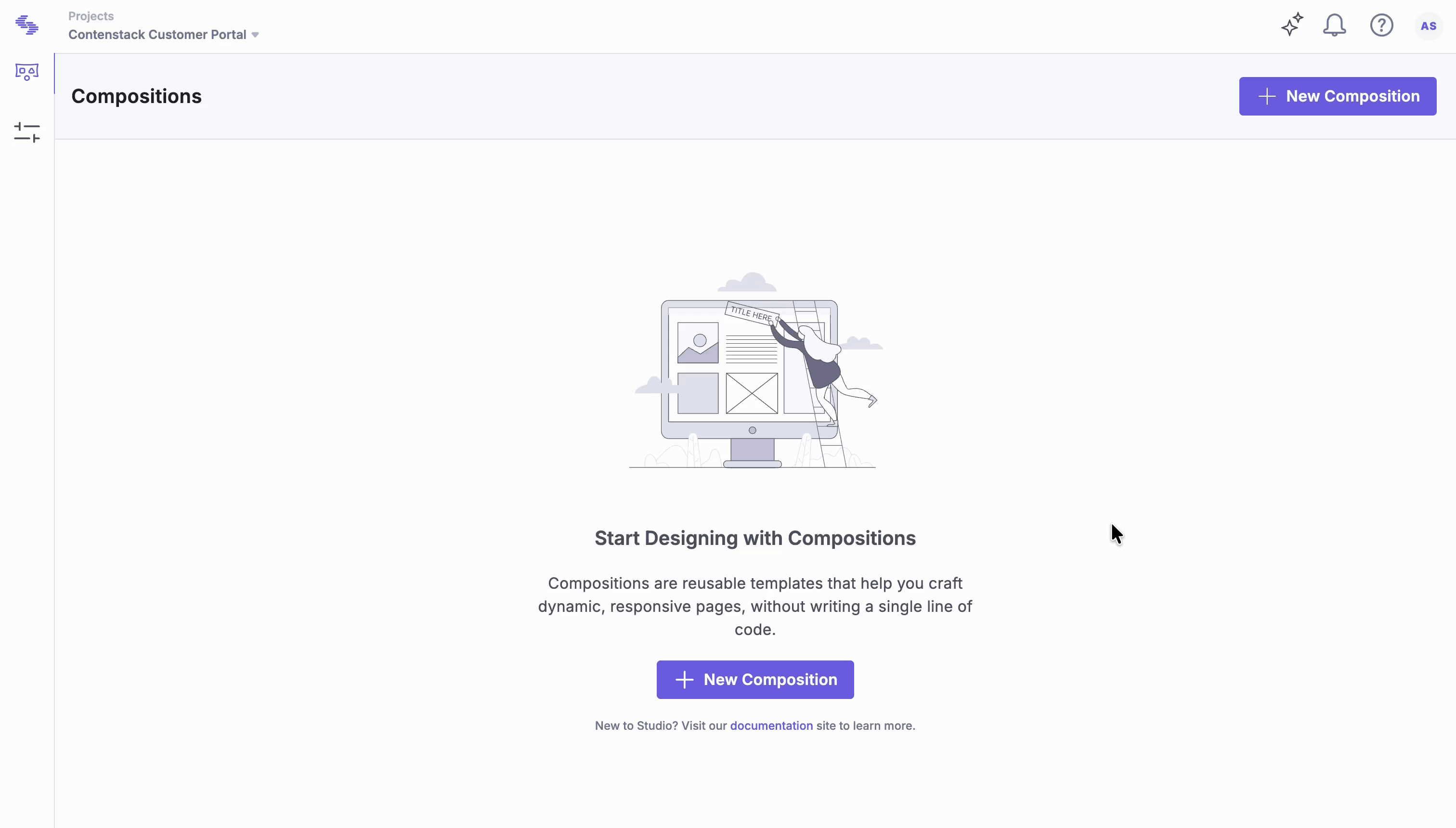
Build a New Page
Note: Studio is currently part of an Early Access Program and may not be available to all users. Contact the Contentstack support team; they will coordinate with the appropriate stakeholders to review eligibility.
Building a new page in Studio lets you combine reusable components and tokens to create structured, composable experiences. This guide shows how to create, configure, and preview a new page composition while maintaining alignment between design and content.
This article demonstrates how to create full-length pages using both free form and linked compositions. The goal is to build three pages: an About Us page, a Blog Listing page, and a Blog Template page for individual blog posts.
Prerequisites
Before you begin building a new page, make sure your environment is configured correctly.
- Ensure you have set up your Studio project and connected it to your front-end project (CSR or SSR).
- You have Admin or Developer permissions to modify composition structure.
Tip: Ensure your Figma Plugin integration is active if you plan to sync and preview designs.
Standalone Pages
Standalone pages are uniquely designed and not derived from shared templates. Examples include the Home page and the Contact Us page. Use a freeform composition to create each standalone page.
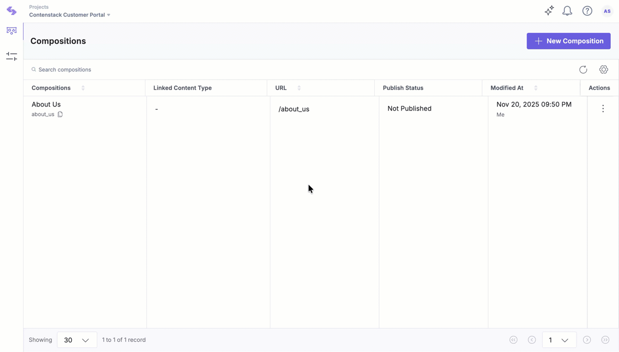
Create a New Composition for About Us Page
Compositions define the structure and layout of a page in Studio. This section explains how to create a new composition that serves as the foundation for your page, where you can add components and configure layout settings.
- Click New Composition.
- Select Composition Type: select Freeform.
- Enter a Name (e.g., “About Us” or “Product Overview”).
- Define the URL Path (e.g., /about-us). This path not only opens the page in the composition editor but also serves as the live URL for the About Us page.
- Click Create.
In this use case, the About Us page requires a freeform composition, which has been created accordingly.
Rendering a Specific Composition Route
After creating a composition in Studio, create a new file to render the corresponding page in your project. The following example uses a CSR React setup.
- Create an about.tsx file and use the useCompositionData hook to fetch the composition data. Then render the StudioComponent.
import {
  StudioComponent,
  useCompositionData,
} from "@contentstack/studio-react";

export function AboutUs() {
  const { specOptions, isLoading, error } = useCompositionData({
    compositionUid: "about_us",
  });

  if (error) {
    return (
      <div className="flex flex-col items-center justify-center min-h-[calc(100vh-6rem)]">
        <h2 className="text-xl font-semibold text-midnight mb-2">
          Something went wrong
        </h2>
        <p className="text-primary text-center max-w-xs">
          We couldn't load this page right now.
          <br />
          Please refresh or try again later.
        </p>
      </div>
    );
  }

  if (isLoading) {
    return (
      <div className="flex items-center justify-center min-h-[calc(100vh-6rem)]">
        <span className="animate-spin rounded-full h-8 w-8 border-t-2 border-b-2 border-primary"></span>
      </div>
    );
  }

  return <StudioComponent specOptions={specOptions} />;
}
This setup fetches the composition specification using the compositionUid and renders the associated content. A loading indicator is displayed while the request is in progress. If an error occurs, an error message is shown. In most cases, a 404 fallback page is rendered for missing or invalid compositions.
- Ensure that a React Router is already configured in the project. Then, add a new route for the About Us page in the App component.
function App() {
  return (
    <>
      <Navbar />
      <BrowserRouter>
        <Routes>
          <Route path="/" element={<Home />} />
          <Route path="/about-us" element={<AboutUs />} />
        </Routes>
      </BrowserRouter>
      <Footer />
    </>
  );
}
Once the route is configured, open the composition in Studio and drag and drop the necessary components on the canvas to visually build the About Us page.
In this setup, each new page requires a new file, manual composition fetch logic, and a route definition before the page can be designed in Studio. This can be streamlined using a generic component that dynamically renders compositions based on the route, eliminating the need for code changes for every new page.
Render a Composition for a Wildcard Route
To dynamically render compositions based on the current URL, rename the about.tsx file to compositionRenderer.tsx and update the function name accordingly.
Instead of using a static compositionUid, use the current URL to fetch the corresponding composition spec. This approach allows the path to determine the composition rendered on the page.
In this example, React Router is used to access the pathname:
const location = useLocation();
const url = location.pathname;
const { specOptions, isLoading, error } = useCompositionData({
  url,
});
The complete code looks as follows:
import {
  StudioComponent,
  useCompositionData,
} from "@contentstack/studio-react";
import { useLocation } from "react-router";

export function CompositionRenderer() {
  const location = useLocation();
  const url = location.pathname;
  const { specOptions, isLoading, error } = useCompositionData({
    url,
  });

  if (error) {
    return (
      <div className="flex flex-col items-center justify-center min-h-[calc(100vh-6rem)]">
        <h2 className="text-xl font-semibold text-midnight mb-2">
          Something went wrong
        </h2>
        <p className="text-primary text-center max-w-xs">
          We couldn't load this page right now.
          <br />
          Please refresh or try again later.
        </p>
      </div>
    );
  }

  if (isLoading) {
    return (
      <div className="flex items-center justify-center min-h-[calc(100vh-6rem)]">
        <span className="animate-spin rounded-full h-8 w-8 border-t-2 border-b-2 border-primary"></span>
      </div>
    );
  }

  return <StudioComponent specOptions={specOptions} />;
}
Next, update the App.tsx file to include a wildcard route that renders the CompositionRenderer component:
function App() {
  return (
    <>
      <Navbar />
      <BrowserRouter>
        <Routes>
          <Route path="/" element={<Home />} />
          <Route path="*" element={<CompositionRenderer />} />
        </Routes>
      </BrowserRouter>
      <Footer />
    </>
  );
}
After completing this setup, create new compositions in the Studio app. They will render in the Studio canvas based on the route, no additional code changes required.
Additional Resource: Refer to the Create Editable Page Sections use-case for examples of how to design compositions in the Studio canvas.
Create Reusable Templates
Instead of coding the UI for each individual blog page, a single template is created and reused. Based on the URL, the corresponding blog data is rendered dynamically. Studio follows the same approach, create a template once, link it to a content type, and publish it to see the correct data populate in real time.
In this example, the goal is to set up blog pages using a linked composition.
- Click New Composition.
- For Composition Type, select Linked Composition.
- Enter a Name (e.g., Blog).
- Define the URL Slug (e.g., /blogs/*). This slug matches wildcard routes in production to load the correct composition.
- Click Create.
Once the blog composition is created and configured, it can be reused across multiple blog pages. This approach streamlines development, ensures consistency in layout, and enables dynamic rendering of content based on URL patterns.
Linking Data from the Preview Entry
When a linked composition is created, the Preview Entry section becomes available in the Page Data tab. This section allows connection to preview-specific content, enabling dynamic rendering in Studio without affecting live data.
In the Settings tab, clicking the data icon opens the data binding panel. A new section appears, allowing data from the preview entry to be linked to component fields, similar to earlier configurations. Studio handles the underlying logic automatically.
To preview the template using different entry data, return to the Page Data tab and select Replace Entry in the Preview Entry section.
Aside from the data binding functionality, the overall process remains consistent with freeform compositions.
Studio enables teams to visually compose, preview, and manage modular digital experiences. With reusable components, design tokens, and editable sections, it enhances collaboration and promotes design consistency across projects.
More articles in "Key Use Cases"
