

Venus Design System 2.0: UI updates for enhanced user productivity
.jpeg)
Introducing Venus Design System 2.0
In our relentless pursuit of delivering a seamless user experience for our users, we understand the importance of continuous improvement and iteration to achieve that goal. That’s why we’re thrilled to share our Venus Design System updates, focused on enhanced user productivity and accessibility. As you may recall, we chose Venus, like the Roman goddess of beauty and love. It is the visual expression of our love and care for our customers.
In this blog, we'll dive into the recent user interface (UI) updates for the content manager screens, taking you behind the scenes of the standardization of design components, user navigation, improved spacing, icon enhancements, and more. Buckle up as we explore these changes that will elevate your experience with our platform.
UI elements & styling enhancements
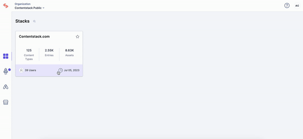
Refreshed cards on Stacks homepage
These UI updates create a visually appealing and more informative card interface. You will find it easier to navigate and gain deeper information about each Stack.
-
New background colors, icons, and sectioned design
-
Improved text spacing for readability
-
Added total user count per Stack
- Tooltips when hovering for truncated Stack names
Enhanced accessibility
Our accessibility improvements make the app more user-friendly and inclusive. Users with varying needs will experience enhanced readability, easier interaction, and consistent icon behavior, promoting a more accessible and enjoyable experience.
-
Tooltips when hovering
-
Updated fonts and spacing for headings (H1, H2, H3)
-
Larger action buttons for improved navigation
-
Standardized family of icons for greater cohesion
-
Icons now function as buttons with primary, secondary, and tertiary states
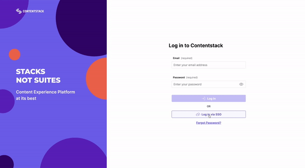
Updated user login experience
These updates to our user login page introduce a more user-centric and efficient login experience, promoting ease of use, clarity, and an aesthetically pleasing interface.
-
Updated user flow for login via SSO, now with buttons instead of tabs
-
Validation messages are now shown below the text input fields
-
The “Submit” buttons will be disabled until the validation passes
Navigation & layout improvements
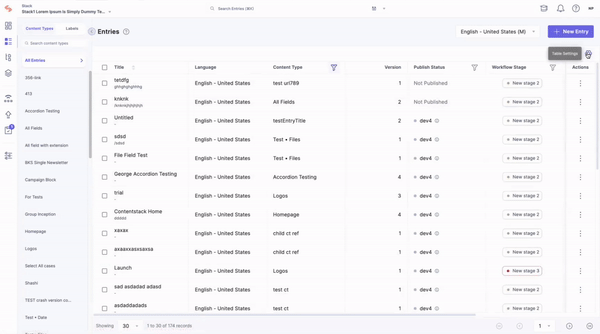
Updated Entry & Asset List UIs
The updated tabs components provide a more focused and efficient way to navigate through both the App's Entry & Asset List UIs, making it easier to switch between sections and find exactly what you need.
-
New toggle navigation between Content Types and Labels tab
-
Enhanced table filtering, which is now easily identifiable with a filter icon.
-
Added pagination on the Entry List page
-
Table resize functionality
-
Added collapse/expand functionality for the left-hand side menu
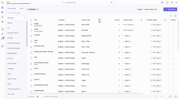
Table management and custom views
With more organized and user-friendly table management, you can customize the table view and manipulate tables more easily, reducing frustration and errors.
-
Improved table filtering with an identifiable filter icon
-
Enhanced column management with functionality to freeze/unfreeze columns in table view
-
Updated asset cards in the thumbnail view
-
Improved spacing of asset results with a 4-grid or 8-grid view to prevent element misalignment
Icon, button & alert refinements
Removed icons for action buttons in pop-up modules
Removing distracting icons on non-destructive action buttons allows you to focus on the task without unnecessary visual clutter, leading to a cleaner and more efficient user experience.
Entry Editor
These icon and text field changes enhance visual clarity and consistency, making creating and editing Entries easier, resulting in a more user-friendly content management experience.
-
Cosmetic change of icons in entry outline from solid fill to stroke family icon
-
Outlined border of the text field when you hover over a content block in the entry editor
Alerts
The defined alert colors help you quickly identify different types of alerts, reducing confusion and improving overall user communication within the app.
-
Defined 4 new colors for different alerts
-
Information: blue
-
Messaging: red, amber, gray
-
.gif)
What's on the way?
In conclusion, our recent efforts to revamp our app's UI through Venus Design System 2.0 signify a pivotal moment in our commitment to delivering an exceptional user experience. The Venus redesign was just the beginning of this journey, and we're thrilled to see how this innovative design system is already making a positive impact. By meticulously auditing all app screens and implementing audit-suggested changes, we ensure a consistent and streamlined interface across the board.
This initiative is more than just an update; it's a testament to our unwavering dedication to our customers' app experience. As we refine and evolve our UI, we're excited to see how these changes will empower you to navigate our app effortlessly and enjoy a more satisfying digital journey. Stay tuned for more exciting developments of our platform’s developer screens, and thank you for being part of our ongoing transformation.
About Contentstack
The Contentstack team comprises highly skilled professionals specializing in product marketing, customer acquisition and retention, and digital marketing strategy. With extensive experience holding senior positions at renowned technology companies across Fortune 500, mid-size, and start-up sectors, our team offers impactful solutions based on diverse backgrounds and extensive industry knowledge.
Contentstack is on a mission to deliver the world’s best digital experiences through a fusion of cutting-edge content management, customer data, personalization, and AI technology. Iconic brands, such as AirFrance KLM, ASICS, Burberry, Mattel, Mitsubishi, and Walmart, depend on the platform to rise above the noise in today's crowded digital markets and gain their competitive edge.
In January 2025, Contentstack proudly secured its first-ever position as a Visionary in the 2025 Gartner® Magic Quadrant™ for Digital Experience Platforms (DXP). Further solidifying its prominent standing, Contentstack was recognized as a Leader in the Forrester Research, Inc. March 2025 report, “The Forrester Wave™: Content Management Systems (CMS), Q1 2025.” Contentstack was the only pure headless provider named as a Leader in the report, which evaluated 13 top CMS providers on 19 criteria for current offering and strategy.
Follow Contentstack on LinkedIn.

Recommended posts


